Weft and warp: Kelcy Taratoa and Ian Scott in Wellington
By Chris Holdaway, 12 Dec 2019
November 2019 saw the sixth annual Lit Crawl blow out into the inaugural Verb Literary Festival. Along with four other poets who were published in Issue Six of the journal Sweet Mammalian, I was awarded a micro-residency to spend the festival days working in the environs of a Wellington art gallery. I found myself stationed behind a neat trestle table at Bartley + Company Art on Ghuznee Street, some papers lying around for poems I had planned to work on, bathed in the retro TV glow of The Grey Space Te Kore-te Wiwia by Kelcy Taratoa (Ngāi Te Rangi, Ngāti Raukawa).
Widely exhibited for digitally native and futuristic pop art, this show marks a change in direction for the Mt Maunganui-based artist. Instead of his established MO of jumping off from pop-cultural ingredients to transform and riff on, the accompanying materials explain how Taratoa began this new body of work by studying the patterns and forms from tukutuku panels that line the walls of whare, before deploying his familiar infusions and metamorphoses of newer patterns and objects from growing up as a young man in 80’s consumerism and entertainment. It’s not difficult to imagine the five tall portrait canvases along the main wall of the gallery standing in the pillar and panel pattern of the woven walls of a cyberpunk whare.

Kelcy Taratoa at Bartley + Company Art
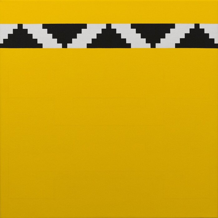
The stark black, white, and red palette often associated with Māori patterns is here, along with the limited blue, green, and yellow colourspace of early arcade games. The more muted and pastel pinks and blues recall the watercolour tones often used in hand painting comic books — more organic moments concealed by the otherwise immaculately geometric and matte finish. From hand-woven patterns to circuit boards or video game levels. Ancient cross-hatching to retro stair-stepping. 8-bit icons. Digital letterforms.
The pale grey maze of To be as the Seer / Kei tua o Te Arai, punctuated by small islands of colour, has the distinct look of a Pacman stage with its bright yet disparate ghosts, fashioned from the roimata tukutuku. The flatness of Poutama Pungo ki te Wāhi Ngaro features reduced yet potentially monstrous forms you could just about bounce on to kill, on a small yet noticeably deep canvas that feels awfully like an old CRT screen (450 x 450 mm). Meanwhile, the tessellated blocks of Aro Transcending the Ambiguity of Existence sit squarely in the green and magenta genre of TV test card. Cloaked in his lived experience and signifiers of western pop culture’s pulpy heroes and battles, the urban and detribalised Taratoa (his words) ventures after new and yet older heroic stories and ancestors encoded in the tukutuku — partly alien to him even as they are his birthright.
With the tense combination of diagonals and straight lines in the largest work that dominated an entire wall of the gallery as soon as you walked in — Manu Rerenga, Waewae Pākura (2130 x 1521 mm) — it was hard for me not to think of something like Frank Stella’s fiercely monumental V Series, as well as the poutama tukutuku. Taratoa’s works are not disciplined in the same way as that paragon of hard abstraction, as is to be expected from an artist working with much murkier notions of identity formation over time, despite, or perhaps because of, his life of disconnection from that minority cultural and spiritual heritage. Now all too aware of how another dominating culture decided to replace his icons of Te Ao Māori with those of western consumerist entertainment without his consent (if not against his will), it would be impossible for Taratoa to experiment exclusively by working through a series of decisions of form as many abstractionists would purport to do.
For all their surface digitalism, there’s a real organic mess living in these works, reflecting the handmade craft from whence the journey began. Take the almost invisible patterns main body of the small canvas Poutama: much more the province of the analogue world’s deeply subtle gradations than the on/off digital hard edge, referencing the yellow-flowering pohutukawa tree that is found only on Motiti Island in the Bay of Plenty.

2a Manu Rerenga, Waewae Pākura
Poutama
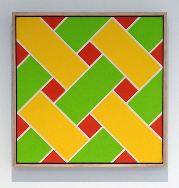
On a Saturday I walked a few blocks from Bartley + Company to the opening of Ian Scott: Minimal Lattices 1978—1988 at Hamish McKay gallery: another extremely bold vision of colour and geometry, and a flute of champagne at one in the afternoon. The Lattices are iconic facts of Aotearoa’s art, especially the so-called liquorice allsorts with bold black strips joining vibrant colours. As the name suggests, this show offers some more subtle examples, including a number of monochromes in more muted pastel colours than what many would associate with the Lattices. Begun in the 70s, Scott found truly endless possibilities in this motif, and continued working through the series with terrifying productivity until almost the day he passed away in 2013.
The patterned surface of the Lattices has often lead to comparisons with weaving, and given the Aotearoa context, particularly to Māori flax weaving. Te Papa encourages this in their wall label to the grand black and unprimed canvas Lattice no. 91 that has been part of their standard display for some time now: “Notice how your eyes weave together the strips.” It’s easy to see how this comes about. In Small Lattice #168 in Minimal Lattices, you could take the small red diamonds and triangles as a view to a background, over which green strips run from bottom-left to top right, while yellow strips weave under and over from bottom-right to top-left. Scott for his part never thought much of this overly didactic reading (see Ian Scott: Lattices by Ed Hanfling, p.24-6), and I think these so-called minimal Lattices provide good examples to help break down our desires for the paintings to represent some 3D object, to see the autonomy with which Scott was considering every element of his canvases.
Most obvious is Small Lattice #99, which might astonish even those who think they are familiar with the Lattice series. With even just a little inspection, it becomes clear that the strips are not whole or contiguous: lines that would serve as edges fail to strongly separate blue blocks from white from black, and the small diamonds often taken as the background in the weave theory bleed into the rest of the structure. Everything snaps into a flat 2D surface — which is the literal reality of a painting — rather than a pretence at layered 3D space. It’s a bit like the silhouette illusion of the spinning dancer, where you can alternatively force your brain into seeing either clockwise or counter-clockwise rotation projected in 2D shapes.
Small Lattice #168.jpg

Small Lattice #99
Once you’ve got this perspective shift under your belt, it works just as well on more subtle examples. In the subdued white and unprimed canvas combo of Small Lattice #126 it’s again the smaller diamonds and channels running from them that refuse to solidify into the borders of woven strips, while the much larger yellow gulfs in Small Lattice #23 (blue and yellow) stretch to the point of breaking any reasonable ability to read the pattern as weaving. The trick is to see each piece of colour as an autonomous whole, but not in the sense of a conventional tangible object. Without those artificial limits, you’ll have a lot more fun and get a lot more mileage out of all the endless variations in this important series.
One of the most remarkable aspects of Scott’s oeuvre is its breadth, and utter refusal to be confined to any one aspect as the main one. As if it wasn’t enough to produce some of our most significant pop art, post-modern appropriations, and magic realism in painting, Scott was on the cutting edge of abstraction on an international level (archival material at the recent Michael Lett show reveals that Scott’s work was admired by US colour field giant Kenneth Noland), and is one of our foremost thinkers about how to engage with the pictorial frame. But he was a long way from a cool or detached formalist, and I think Minimal Lattices shows the humanity present even in these stark geometric works, particularly in presenting attenuated tones alongside the more familiarly vibrant. The works sit comfortably in natural wood frames, as if to remind us that these patterns are ultimately diagrams of someone’s eye, maps of their seeing. There is a beautiful photograph by his son Chris Corson-Scott — My Father's Studio, Three Months After His Death From Cancer — in which you can see a sketchbook open with diagrams for planned lattices, on which sit an undisturbed pair of glasses.
This exhibit follows Sprayed Stripes and New Lattices at Michael Lett in 2017, where specimens as recent as 2012 showed Scott getting down to the absolute bones of the Lattices, especially a grave white canvas featuring a single pink stripe, which might be the last one he completed before passing. It’s as good an example as any of the autonomy I’ve been trying to describe in each instance of lattice colour. As iconic as this series is, our collective understanding is still only partial, as Scott left so much more to discover in his archives, in all his bodies of work. No matter how disparate his directions became, he never stopped working on the Lattices, covering a lot of ground that has yet to be exhibited publicly. It’s the unenviable project of his family to work on bringing these gradually to the world in a way we can all make sense of, so it’s good to see regular progress.
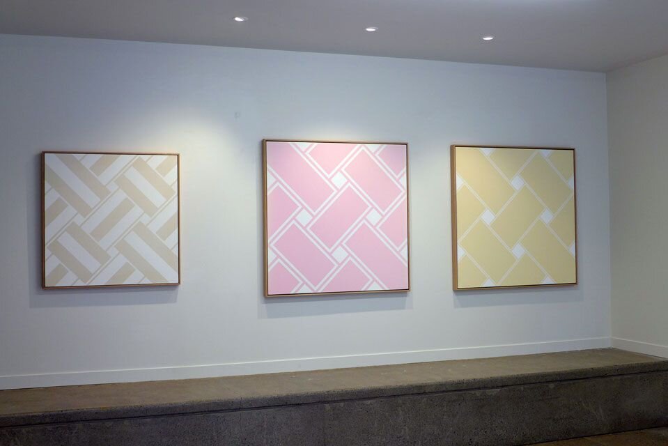
Small Lattice #126, Lattice #120, Lattice #121
It was a lot for one day: two parts sensory overload, one part whiplash. The commercial and arterial banality of Taranaki Street, and the cute chaos at the corner of Ghuznee and Cuba almost more than I could bear heading back to my desk at Bartley + Company.
Taratoa’s work is also abstraction, but in the more technical sense of taking something and processing it in a way that is both a development and a simplification into another representation, rather than in terms of the (dubious) figuration-abstraction binary. Even as the shapes in these panels can be said to abstract from motifs of Te Ao Māori or retro culture, they remain deeply figurative in their presentation. For my money this comes together best in the flux of Kia Aupikinga te Poukapa. A jagged space invader shape sits at the bottom of a canvas like a pillar that depicts ancestors stacked proudly from floor to ceiling, and a solid blue section in the middle screams 8-bit awa. It’s easy to feel the interlocking rectangular texture arising out of woven patterns, with an overall pixellation that suggests the process hasn’t quite finished loading, the download still ongoing. To me it’s the most alive of all the works, a picture of identity, holistically fragmented.
As a poet I did not end up responding creatively to this exhibit — a possibility but not a requirement of the micro-residency — as there’s already such a wealth of symbolic content that I’m not sure what I could have added of worth. The best advice I can give at this moment is to forget Frizzel’s hack tiki-to-mickey, and even Shane Cotton’s more mannerist juxtaposition of toi moko, native birds, targets, and play or pause icons: Taratoa’s mutation between tiki and space invader is invested with some real politics of how 80’s pop and consumer culture defined his relationship to society more than his own whakapapa, and how he’s had to dig back to that heritage through the assimilation once sold to him as entertainment. What a legend.
Shouts out to Verb Festival for giving me this time in Wellington, to Alison at Bartley + Company for hosting me extremely generously, and to Hamish McKay for the early afternoon hooch and great chat.
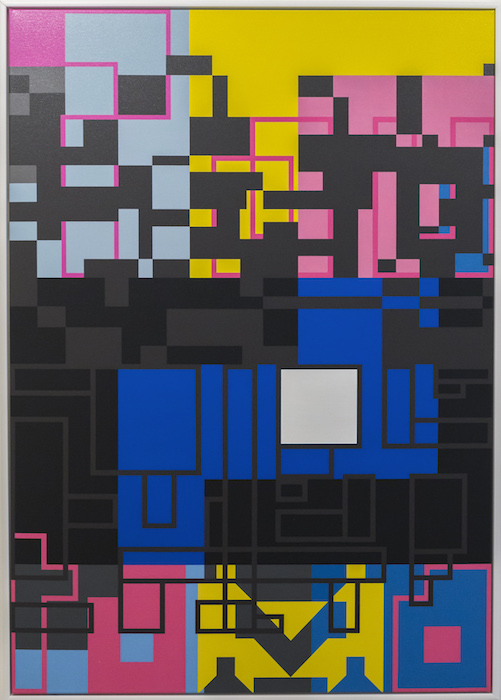
Kia Aupikinga te Poukapa